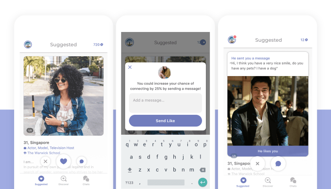
How do other dating apps compete with Tinder? By further distancing themselves from Tinder’s “hot-or-not” user interface design to focus on differentiating features — like conversation starters, commenting and richer profiles. Today, another anti-Tinder app is doing the same. On the heels of its $12 million Series B announced earlier this year, the oddly named app Coffee Meets Bagel is today announcing a significant makeover, which includes a change to the way the app works.
Its cleaner, lightweight and more modern design does away with bright, competing colors and other outdated features, the company says. But more notably, it has ditched the big “Pass” or “Connect” buttons — its earlier variation on Tinder’s “like” and “dislike” buttons, which nearly all dating apps have now adopted.
Instead, Coffee Meets Bagel’s new interface puts more emphasis on user profiles — showcasing more of the text, and giving users the option to “heart” the profile or now, even comment.
Before a match takes place, users can tap a new commenting button that allows them to respond to the user’s profile directly, before making a connection. This could help potential matches break the ice or even spark a connection that may not have otherwise happened.
The feature is similar, to some extent, to the commenting feature in Hinge, a relationship-focused app that allows users to directly comment on some aspect of another user’s profile.
Coffee Meets Bagel says that during its beta testing, members who sent comments to their matches had a 25 percent higher chance of getting liked back. And when comments led to conversations, there was a 60 percent increase in total messages exchanged.
Focusing on enabling better conversations is a good way for other dating apps to combat Tinder, which leaves communication up to the users to initiate, without much guidance. This leads to inboxes filled with “hi’s” and nothing much else to say. By integrating commenting into profiles, however, users will be prompted to start conversations based on something they’ve read — allowing people to connect based on more than just their photos.
The app has also revamped its Discover and Suggested sections to offer seamless scrolling and better navigation, respectively. These sections are less cluttered than before, too, in keeping with the more minimalist spirit. Even the Coffee Meets Bagel logo has gotten a makeover, where the C and B now meet in the shape of a heart.
“We’re taking a stance against online dating conventions, like ghosting and treating people like profiles. We’re expanding the conversation to the self: self-reflection, self-discovery, and self-love,” the company explains in its announcement.
Coffee Meets Bagel has raised just under $20 million since launching back in 2012, but it’s faced threats from Tinder, which has challenged its model head-on with Tinder Picks — a curated selection of matches for Tinder Gold subscribers, similar to Coffee Meets Bagel’s curated daily picks.
The company’s app has close to 7 million installs to date, according to data from Sensor Tower, and more than $25 million in gross revenue. The revenue is growing over time, the firm also found, with users spending approximately $900,000 in the app last month, up 30 percent from November 2017.
Source: Tech Crunch Startups | Coffee Meets Bagel goes anti-Tinder with a redesign focused on profiles, conversations
No Comments