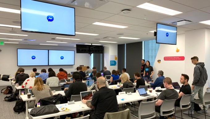
If Facebook Messenger’s redesign succeeds, you won’t really notice it even happened. I hardly did over the past week of testing. There’s just a subtle sense that the claustrophobia has lifted. Perhaps that’s why Facebook decided to throw a big breakfast press event with 30 reporters today at its new downtown San Francisco office, complete with an Instagram-worthy donut wall. Even though the changes are minimal — fewer tabs, color-gradient thread background and a rounder logo — Facebook was eager to trigger an unequivocally positive news cycle.
Old Messenger versus New Messenger
In the seven years since Facebook acquired group chat app Beluga and turned it into Messenger, it’s done nothing but cram in more features. With five navigation bar options, nine total tabs, Stories, games and businesses, Messenger’s real purpose — chatting with your friends — started to feel buried. “You build a feature, and then you build another feature, and they are piling up,” says Facebook’s head of Messenger Stan Chudnovsky. “We either continue to pile on, or we build a foundation that will allow us to build simplicity and powerful features on top of something new that goes back to its roots.”

The old, overloaded Messenger
But suddenly uprooting the old design with a massive overhaul wasn’t an option. “It’s impossible to launch something for 1.3 billion people that will not piss people off,” Chudnovsky told me. “It takes so much time to test things out and make sure you’re not doing something that will prevent people from doing things that are really, really important to them. At the end of the day, no one really likes change. People generally want things the way they are.”
So starting today, Messenger is globally rolling out an understated redesign globally over the next few weeks. It’s got a simpler interface with a lot more white space, a little less redundancy and a casual vibe. Here’s a comparison of the app before and after.
Old Messenger:
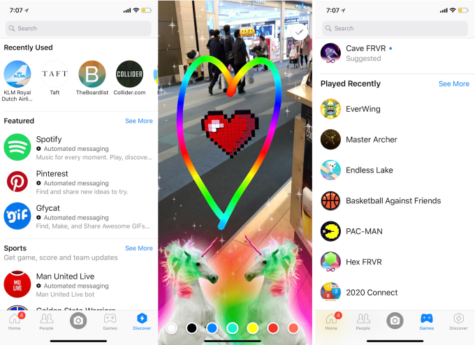
Previously, there were five main navigation buttons along the bottom of the app. Between the actually useful Chats section that’d been invaded by Stories and the chaotic People section, there were tabs for calls, group chats and active friends. Between them was a camera button that aggressively beckoned you to post Stories, a dedicated Games tab and a Discover tab for finding businesses and utility app.

New Messenger:
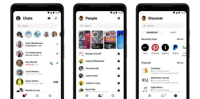
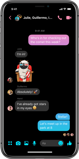
In Messenger v4, now there are just three navigation buttons. The camera button has been moved up next to the chat composer inside the Chat section above Stories, People now contains the Active list as well as all Stories by friends, and Discover combines games and businesses. The fact that Stories is in both the Chats and People section make it seem that the company wants a lot more than the existing 300 million users across Facebook and Messenger opening its Snapchat copycat.
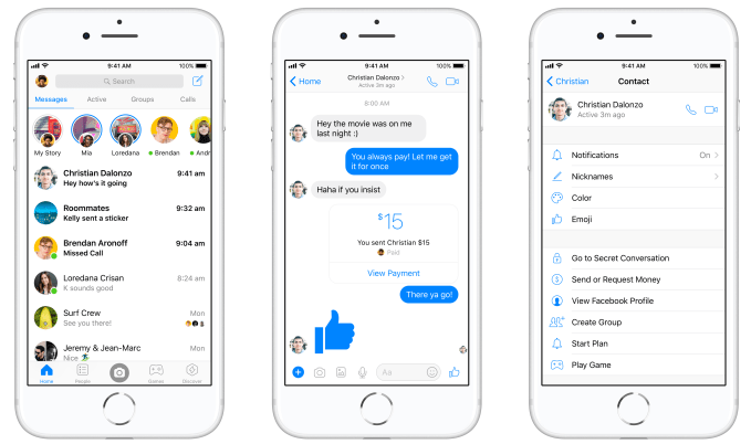
While 10 billion conversations with businesses and 1.7 billion games sessions happen on Messenger each month, and both hold opportunities for monetization, they’re not the app’s purpose, so they got merged. And though 400 million people — nearly a third of all Messenger users — make a video or audio call each month, those typically start from a button inside chat threads, so Facebook nixed the Calls tab entirely.

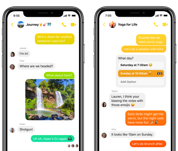
All the old features are still available, just not quite as prominent as before. The one new feature is several color gradients you can use to customize specific chat threads. If you rapidly scroll through the messages, you’ll see the bubble background colors fade through the gradient. And one much-requested feature still on the way is Dark Mode, which Facebook says will launch in the next several weeks to reduce glare and make night-time usage easier on the eyes.

Finally, Messenger has a softer new logo. The sharp edges have been rounded off the quote bubble and lightning insignia. It seems designed to better compete with Snapchat and remind users that Messenger is fun and friendly, as well as fast.
![]()

Inside the Messenger War Room
With the company’s downward scandal spiral of breaches, election interference and fake news-inspired violence, it’s not just Messenger that’s a mess. It’s all of Facebook, both literally and metaphorically. Cleaning up, fighting back — those are the messages the company wants to drive home.


Hopefully, this will be the start of a company-wide interface cleanup. Facebook’s main app is full of cruft, especially with products like Facebook Watch stuffed in the nav bar despite lukewarm user interest. Messenger did a good job of ceasing to shoehorn the camera and games into our chat behavior, though Stories still appear twice in the app even if some wish they disappeared permanently. The world would benefit from a Facebook more concerned with what users want than what it wants to show them.
With the news going live just an hour after the event ended, many reporters stayed, writing their posts about Facebook while still inside Facebook. Chudnovsky admitted that beyond educating users via the press, the event was designed to celebrate the team that had labored over each pixel. “You can imagine at a company like ours, how many conversations you have to have about changing the logo.”


Source: Tech Crunch Mobiles | Messenger redesigns to clean up Facebook’s mess


No Comments